Expressive in Motion. Iconic in Context.
Guided by product behavior, our brand comes to life through interaction, allowing its form, motion, and identity to adapt without losing its essence.
| Principle | Alignment question | Description |
|---|---|---|
| Adaptive | Chameleon by Design “Does this feel like Buzzvil in any context?” | The brand adapts to its context—logo color, partner environments, light or dark—without losing identity. We default to monochrome for a clean aesthetic but allow expression in partner contexts. Form and identity stay recognizable across every touchpoint. |
| Motion | Expressive in Motion “Would this be stronger in motion?” | Our brand comes to life through interaction and motion. Guided by product behavior, we prioritize vector, Lottie, and code-driven visuals over static imagery. Motion adds clarity and delight; static is a last resort. |
| Real | Real, Not Stock “Is this unmistakably ours?” | Imagery must be real: our product, our people, our space. Actual screenshots and flows, candid photos, authentic visuals. No stock photography. Trust and authenticity come from showing what we truly build and who we are. |
| Clarity | Clarity & Contrast “Is it legible and confident at a glance?” | We aim for a high-contrast, clean look: grayscale as primary palette, accent used sparingly. Typography is legible and confident; clearspace and hierarchy are non-negotiable. The brand should read at a glance. |
| System | One Coherent System “Does this fit our system?” | Brand guidelines, tokens, and conventions ensure one coherent system across all platforms and touchpoints. From logo usage to color, typography, and voice—consistency is how we build recognition and trust. |
“Does this feel like Buzzvil in any context?”
The brand adapts to its context—logo color, partner environments, light or dark—without losing identity. We default to monochrome for a clean aesthetic but allow expression in partner contexts. Form and identity stay recognizable across every touchpoint.
“Would this be stronger in motion?”
Our brand comes to life through interaction and motion. Guided by product behavior, we prioritize vector, Lottie, and code-driven visuals over static imagery. Motion adds clarity and delight; static is a last resort.
“Is this unmistakably ours?”
Imagery must be real: our product, our people, our space. Actual screenshots and flows, candid photos, authentic visuals. No stock photography. Trust and authenticity come from showing what we truly build and who we are.
“Is it legible and confident at a glance?”
We aim for a high-contrast, clean look: grayscale as primary palette, accent used sparingly. Typography is legible and confident; clearspace and hierarchy are non-negotiable. The brand should read at a glance.
“Does this fit our system?”
Brand guidelines, tokens, and conventions ensure one coherent system across all platforms and touchpoints. From logo usage to color, typography, and voice—consistency is how we build recognition and trust.
Logo
The Chameleon
The logo is chameleon-like. It adapts to its environment, taking on black or white depending on the background. While it can take on primary or secondary colors in specific partner contexts, we default to the monochrome usage to maintain our clean brand aesthetic.
Partner Context Examples
Logo Treatment
Masking (Image & Video)
As part of our chameleon philosophy, we allow image, illustration, or video injection inside our logo shape. Ensure sufficient contrast with the background.
3D Guidelines
We allow isometric 3D transformations to add depth. The aesthetic must remain abstract, simple, and tonal. Avoid free-form 3D distortion.
Clearspace
Always maintain generous clearspace around the logo to ensure legibility and impact.
Unacceptable Usage
To maintain brand integrity, avoid manipulating the logo in ways that compromise its legibility or form.
Colors
Grayscale
Our primary palette. We aim for a high-contrast, clean look using almost exclusively black and white tones.
Accent Red
Used sparingly for primary actions or critical alerts. Aim for <10% usage in any composition.
Accent Orange
Secondary accent color, complements the red. Use for banners or highlights.
Typography
Design System 26.1 — Typography
Every word carries
intention.
Three typeface roles, one voice. From bold headlines to quiet labels, our typography is calibrated to feel calm, precise, and unmistakably Buzzvil.
Primary: Inter
Our main typeface for all Latin text — headlines, body, navigation, and display. Clean, neutral, and highly legible at any size.
Ads That Work
Where user benefit meets advertiser success
Our logo is a chameleon. It can take any color from our customer/partners. By default and in the context of our brand, it takes the black or white depending on background.
Secondary: Noto Sans KR
Korean companion typeface. Pairs with Inter for bilingual layouts, maintaining visual harmony across languages in headings and body text.
효과적인 광고
사용자 혜택과 광고주 성공이 만나는 곳. 깔끔하고 가독성 높은 한국어 타이포그래피.
Mono: Anonymous Pro / 나눔고딕코딩
Monospace is a brand decision, not a technical default. It signals data precision and trust — core to how Buzzvil communicates authority. You'll see it in dashboards, metrics, kickers, labels, and code.
Product Backend Team
theme: 'dark',
version: 2.0
};
Imagery
Why Motion Comes First
Whether you're building a deck, designing a campaign, or drafting a blog post — these principles help anyone creating visual content for Buzzvil stay consistent and on-brand.
- Motion-first: vector, Lottie, and code-driven visuals capture the energy of the Buzzvil brand.
- Photography and screenshots are powerful when they show something real — our product, our people, our space.
Vector & Lottie First
For presentations, marketing pages, and product visuals — prioritize SVG, vector artwork, and Lottie animations. They're scalable, brand-native, and always crisp.
Real Product, Real Trust
When showcasing what we build, use actual screenshots and interfaces. Real product visuals build credibility far better than polished mockups.
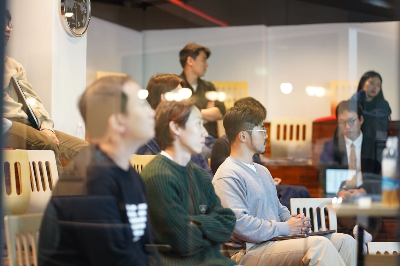
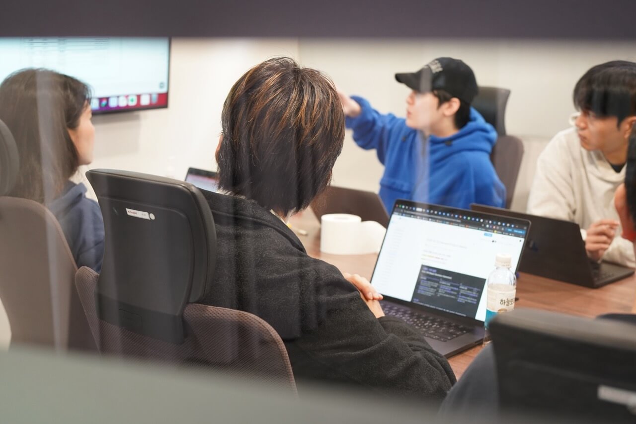
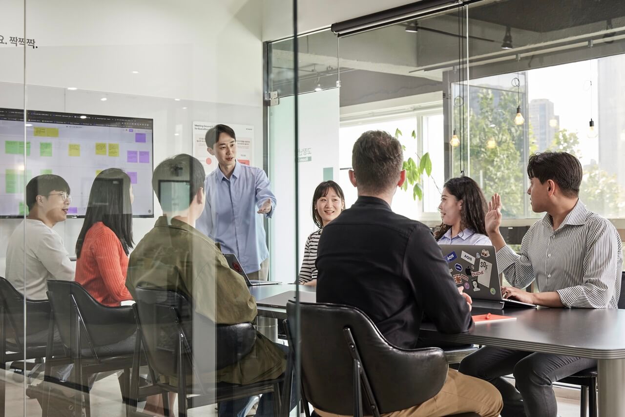
Authentic People & Places
Photos of our team and office reflect who we actually are — candid, natural, and genuine. Authenticity is a brand value, not just a design preference.
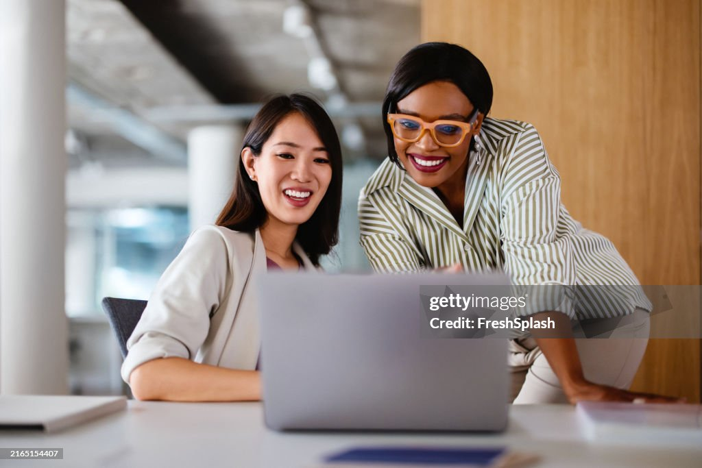
Don't: Stock photography — doesn't reflect our actual team and culture
Don't: Staged scenes — audiences can tell, and it undermines trust

Don't: Generic illustrations — they dilute what makes the brand distinctive
Downloads
Logo Generator
Customize and download the official brand assets. Select the type, choose a color, and get a high-resolution PNG.
Icon Generator
Search and generate consistent iconography. Optimized for reward, points, and game-related interfaces.
Isometric Projection
Generate an orthographic isometric projection of the logo mark. Outputs remain brand-safe, repeatable, and legible at small sizes.